Responsive website for Nookta Architectural Visualization
The portfolio website of Nookta is online!
Berger Schmidt developed the responsive website for the buero specialized in architectural visualization. The website is based on the Open-Source content management framework Drupal and deploys modules like Flex Slider and Lightbox for the emphatic display of the rendered images.
The responsive design makes use of a full screen display and adjusts to mobile devices. Since the website uses high definition graphics it can also be used on very large screens for presentations of the work done by Nookta.
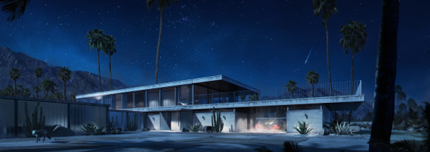
Making of Arrival
On Ronan Bekerman‘s 3D Architectural Visualization & Rendering Blog one can get some fascinating insights into the development of Nookta's rendering work: Making of Arrival.