Portfolio website for make-up artist Pia Valeska The portfolio website of Pia Valeska is online! Berger Schmidt developed the responsive website on behalf of Darmstadt ...
Responsive portfolio website for Daniels + Erdwiens The new portfolio website of Daniels + Erdwiens is online! The team of Berger Schmidt developed the responsive website ...
Responsive website for Nookta Architectural Visualization The portfolio website of Nookta is online! Berger Schmidt developed the responsive website for the buero specialized in ...
Portfolio website for SYRA Schoyerer Architekten BDA The responsive website of SYRA Schoyerer Architekten BDA located in Mainz is online. Drupal agency Berger Schmidt ...
Responsive Drupal website for Sonja Schwarz Photography The new portfolio website of the Frankfurt am Main based photographer Sonja Schwarz is online! Berger Schmidt developed ...
Responsive Drupal Website for Christian Heyse - Photography & Art Direction The new website of Christian Heyse - Photography & Art Direction is online! Berger Schmidt developed the website on ...
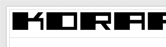
Drupal website for movie production Korafilm The Website of Korafilm, film production for corporate communication based in Darmsatdt, is online. The Drupal service ...
Drupal website for Nina Schaarschmidt The new website of Nina Schaarschmidt is online! Berger Schmidt developed the site using the content management system ...
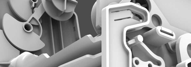
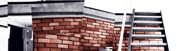
Drupal website for Patzak Design integrating Responsive Web Design The new Website of Patzak Design - Industrial Design & Packaging is online, and follows the principle of Responsive Web ...
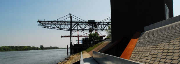
Drupal website for Cineteam Mediaworks The website of Cineteam Mediaworks Gesellschaft für audiovisuelle Medien mbH based in Frankfurt am Main is online ...
Drupal website for Stefan Müller Design The new website of Stefan Müller Design (designmueller.de) is online! Berger Schmidt developed the site based on the ...
Drupal website for the artist Markus Friedrich Staab The website of Markus Friedrich Staab is online! Berger Schmidt developed the site in cooperation with designer Nina ...
Drupal website for Form Royal The new website of Holmer Schleyerbach - Form Royal is online! Berger Schmidt developed the site for the Darmstadt based ...
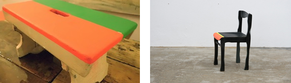
Drupal website for Daniels + Erdwiens - Industrial Design Studio The website of Daniels + Erdwiens - Industrial Design Studio is online! The technical service provider Berger Schmidt - ...
Re-Launch of Synchronschwimmer's website The new website of Synchronschwimmer is online! Berger Schmidt programmed the site to the specifications of the ...
Re-Launch of Atelier Löwentor's website The new website of the Atelier Löwentor is online! Berger Schmidt programmed this site to specifications of the ...
Re-Launch of Sonja Schwarz's website The website of photographer Sonja So Yung Schwarz is online! Berger Schmidt developed the site in collaboration with the ...
Launch of Steffen Bergemann's website The website of illustrator Steffen Bergemann is online! — Berger Schmidt developed the site in collaboration with the ...
Office Darmstadt Address Berger Schmidt Rundeturmstraße 16 64283 Darmstadt Phone 0049 6151 136 16 53 E-Mail info@berger-schmidt.de
Office Karlsruhe Address Berger Schmidt Kapellenstraße 60 76131 Karlsruhe Phone 0049 721 781 713 74 E-Mail info@berger-schmidt.de